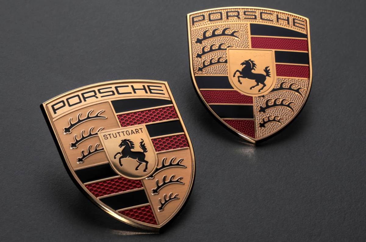
The upcoming 2023 Panamera will be the first to wear Porsche’s new logo.
Porsche has announced that it has changed its logo as part of its 75th anniversary celebrations. The new logo gets a revised design and subtle colour changes that’s intended to “bridge the history and future of the brand”.
- Porsche’s new logo has a 3D effect
- Colours have been subtly changed over the old logo
- Outgoing logo was introduced in 2014
The new 2023 Porsche Panamera will be the first car to wear the German firm’s new crest, with dealerships switching to the new identity around the same time.
Porsche said the new logo was designed to be “instantly recognisable”, while bridging the gap between the history and future of the brand. Porsche said it has a “more substantial silhouette” than today’s crest, which arrived in 2014 as an evolution of the emblem that Porsche has used since 1952. Customers with classic Porsches looking for the original version of the firm’s crest can still order it.
New Porsche logo design
This was achieved over an “intensive” three-year design process that involved widening the top, narrowing the bottom, recessing some elements and raising some others for a more three-dimensional design.
The colours employed have also been subtly changed over the old logo, with the gold being given a darker tinge. The lettering has also been updated with a simpler typeface and thinner font. Porsche says this makes it look “a lot more modern and yet still keeps a traditional touch”. A similar approach has been made to the antlers (which are taken from the Stuttgart region’s coat of arms).
Also, the red bands now feature a honeycomb structure to symbolise the lightweight construction of Porsche’s sports cars, and there are subtle differences in the red colour to give the hexagonal pattern a 3D effect. The web of honeycomb itself is in a slightly lighter tone than the walls of the hexagons.
The horse in the centre – which originated as Stuttgart’s city mascot – has been made to look “more dynamic and more angry”, with the designers trying to give it more of a “thoroughbred” appearance, while the ‘Stuttgart’ lettering above it has been reinstated in black.
“When we presented the crest, there was always the desire to actually feel it and not only look at it. The effect it has, not just as a graphic but also as a 3D piece, was a very strong focus,” said Matthias Kulla, Porsche’s director of design management for its sports car programmes.
Rober Ader, chief marketing officer at Porsche said, “We will be using the crest in a more targeted way to underline emotional highlights. At the same time, the Porsche lettering will gain even greater significance.”
Also see:
Porsche Cayenne facelift to be sold only in base V6 guise in India
500hp Porsche 718 Spyder RS is the final combustion engined Boxster


