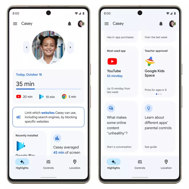
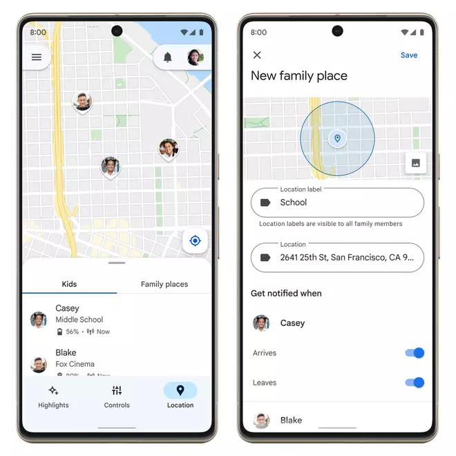
Google has revamped its Family Link app to make it safer for kids to watch content. The Family Link app, also accessible on the web, will feature three tabs: highlights, controls, and location. The app was first launched in 2017 for parents to monitor and control children’s screen time and app usage.
“We have redesigned Family Link to bring our most-used tools to the forefront. Parents will find their favourite features (like screen time limits and blocking and approving apps) in an all-new experience and a central place for viewing requests and notifications,” Google said in a blog post.
The highlights tab shows today’s usage time, the recently installed app, and the most used app. The controls tab enables parents to set screen time limits for each device or specific app, set content restrictions, and manage app data permissions. Screen time limits can also be set in the ‘Today’s Only’ tab without changing the rest of the settings and limits.
Controls
“We are just getting started with the highlights tab and will be updating this section over time with more helpful insights and content,” Google said.

Highlights tab
On the Location tab, parents can track their children’s device location. Users can turn on notifications to track when their child arrives at or leaves a specific destination, like school or soccer practice.


